Saturday, December 11, 2010

Artist Review #14: Vincent Vega

I found Vincent Vega's work on a website dedicated to 6x6 medium format photography. I've been considering saving up/begging for a 6x6 MF lately and Vega's work has all but convinced me. The crispness and intensity of his photographs are stunning. I can't help but think that his work would be significantly hindered with a lesser format. Vega's work captures simplicity and I'm especially drawn to the second images of this sequence. I love how the background seems as though it's a studio backdrop, given authenticity only by the almost-black rocks that stem from the center of the image. The quietness of this photograph is incredibly beautiful; Vega's minimalist images are examples of photographs that I would love to be able to find and take for myself.

Sunday, December 5, 2010

A Personal Review

Since coming to college, I have all but abandoned drawing, painting, and various sorts of mixed media. It's not that I wasn't skilled at doing these things, but when I think of how much anger and frustration they caused me throughout my early scholastic and personal life, I feel repulsed. Ever since I was little and used to nibble on my sandwiches to create perfectly straight lines (a habit I sadly have not yet abandoned), I've been obsessed with perfection. My art is not apart from this fixation.

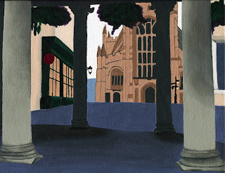
In order to assemble a portfolio for graduate school, I've been looking through my old work. After all, admissions committees want to see that I can hold a pen and use it to draw a straight line. The work that I once thought of as terrible and imperfect now appears well-executed and completely in line with my interest in architecture. Here are a few of my old paintings:
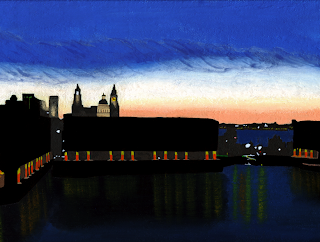
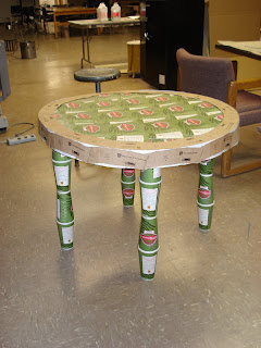
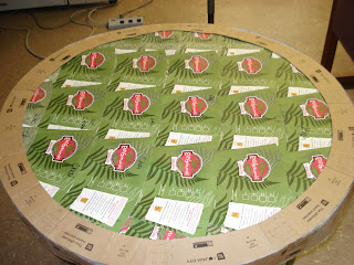
Looking back at my old work makes me think that it might be time to return to other medias in addition to photography. For the past few weeks, I've been craving to build something; to feel materials beneath the tips of my fingers (aside from photo paper, that is) and to work with and manipulate them. I love the way the mechanisms of my manual camera function and respond to my touch, but there's something to be said for creations made in a wood shop or on a dusty floor. Paintings like those shown above breathe and show evidence of craftsmanship. This chai table too is evidence of my ability to fashion something created entirely from myself:
I set out to photograph architecture in order to better understand it; I wanted to truly learn the principles instead of just reading about them in a textbook. For me, photography is a method of observation but also of interaction. I have a profound connection with each of the buildings I capture. I touch them, I walk around them, and if possible, I climb to their peaks. Taking a picture of them only aids in my understanding of their symmetry, functionality, and spatiality. I have been interacting with buildings in this fashion for 11 months now. At this point, I feel ready to attempt a new method to understanding buildings; I feel ready to create one.

Photographs shown below of architectural observations/interactions:

Saturday, December 4, 2010

Artist Review #13: Simon Hoegsberg

I found Simon Hoegsburg on StumbleUpon and was especially drawn to his series entitled "Faces of New York." For this project, Hoegsburg approached 10 strangers on the streets of NYC and asked them to comment on their own face. He then photographed his subjects in a mid-shot and a close-up.

At first, I viewed the images, trying to form my own opinions of each of the characters. For these people, I would have stereotyped them 1) This guy seems like someone to avoid. He looks as though he's snarling. 2) Grandmother type, put together. 3) Artist/musician/not from the area. 4) Old school, baroque styling, out of place. When I read each of the statements, I was really surprised by what I found. 1) Was a crime victim when he first moved to NYC. Adopted a harsh expression to make sure it wouldn't happen again. 2) Used to be beautiful, trying to accept her age, political writer. 3) African, at first didn't know of his origins, wears eyeliner. 4) Attracted to the past, identifies with the women in museums, not the starved models she sees on TV.

I wonder what I would say if someone walked up to me and asked how I felt about my face. Would I comment on the features themselves or my expression? How would my life and my experiences come across to a complete stranger? I applaud Hoegsburg for attempting this project; asking to photograph people can be scary enough, but asking them intimate questions while invading their personal space is even more daring.

Link: http://www.simonhoegsberg.com/

Sunday, November 28, 2010

Artist Review #12: LoftCube Inc.


Designed by Studio Aisslinger, LoftCube Inc. is a German-based conceptual architectural project. Reminiscent of Walter Gropius' "Glass Box" theory, this is a physical manifestation of the Modernist ideal. In the height of Modernism (the 20s and 30s), the architect Walter Gropious defined the architectural movement as an elimination of excessive ornamentation. The way to best accomplish this purely functional goal would be to create a living space comprised entirely of necessary elements: a glass box.

When viewing this cube in Stumbleupon, I was struck by its simplicity and its adherence to the International Modernist Style. Even though most architects are now straying towards Postmodernism-- a more homey version of its predecessor-- this living space is evidence that the once popular movement has not lost its following.

I can't stop thinking about what it would be like to live in a glass cube. There would be almost an uninhibited freedom between myself and the external world. As a nature lover, I find this appealing. However, despite the attraction of this style of living, I can't help but think that I may miss the privacy. If the world were a more open, inviting place and everyone's external affairs were publicized by means of open living space, I would feel completely comfortable following suit. But to be the only one airing my dirty laundry in a literal sense would likely cause discomfort and uneasiness. Thus, while I love the idea of a glass cube and the lifestyle that it affords, it would only be feasible to have such a life if it were to be shared amongst the American and global population.

Thursday, November 18, 2010

Artist Review #11: Thomas Holtkotter


I found Thomas Holtkotter's work on a site dedicated to recognizing amazing examples of architectural photography. The last image in this series was posted on this site and I couldn't stop admiring it. One of my photo professors in Italy once said that you can tell a successful photograph because it's one you feel jealous of. One that you wish that you had taken. Well, I'm completely jealous of this photograph.

I love the way Holtkotter uses unique vantage points for all of his images. He plays a lot with cropping, as seen in the last image specifically. His top image is one that I would have taken; he uses an upwards angle to capture the geometric spaces formed through both positive and negative space. The other images are more unlike my own, yet I admire his ability to use a centrally situated design in a stunning and captivating way.

Viewing Holtkotter's images make me aware of my own style of shooting. I think from now on, I should be willing to pay attention to the positive and negative space formed in the cavities of the building itself and not just settle for the interaction between the building and the natural environment.

Saturday, November 13, 2010

Artist Review #10: Julia Fullterton-Batten

Julia Fullerton-Batten has a resume that makes me jealous; she's worked for New York Magazine, Ford, and the Sunday Times. She's one of the few photographers that can actually make a living doing what she excels at. The first image I saw of hers was the bottom one. At first glace, it seemed really posed and I wasn't sure if that was intentional or not. As I continued to peruse her work, I saw that many of the images shared this surrealistic, hyperrealistic feel. Especially in the top image, the world is completely and obviously distorted. This work was part of her series entitled "Teenage Stories." All of the pieces in this series show large adolescents in a too-small world; Batten uses this as a metaphor for growing up-- big fish in a small pond-esque.

I frequently find myself drawn to surrealist artists, though I find this strange, as my work revolves around the real and the concrete (literally). For such a theoretical person, I find the actuality of my images to be helpful in trying to view the world at face value. If I were to draw images based upon my dreams, I feel I would lose all touch with reality. (My dreams are always epically surreal and generally nightmarish.) Creating photographs and objects based upon the real world is a way to keep myself centered and a way to remain at least somewhat grounded. So while I choose to devote my time to creating works based upon visual realities, I love to view works that mimic my surreal thought processes.

Link: http://www.juliafullerton-batten.com/

Friday, November 5, 2010

Artist Review #9: Bernd and Hilla Becher

The Bechers have been discussed in every photography class I've ever taken. When viewed as single images, their work is nothing special, but when seen in a series, it becomes overpowering. These images are particularly captivating for me, since they depict one of my current obsessions: grain elevators. Specifically, the grain elevators of Buffalo. I try to travel there as much as possible (or as much as my substandard freelancing funds will allow) to photograph them in new ways. Here's an example:
I love the curvature of the central angle in this photograph. Though the grain elevators were never intended to serve as the inspiration for the International Modernist Style of the 20s and 30s, there were some measures taken to make them more aesthetically appealing. Like painting their cornices. In this image, you can just see the black paint where the concrete meets the whiteness of the sky. A completely unnecessary detail, but one I find myself drawn to. Along with the concrete itself. Most modern buildings used concrete or steel. When poured concrete is used, wooden boards hold the substance in place until it dries. This leaves lines (formed by the separate wood panels). Generally, these divisions are sanded off, but as seen in this image, the ones on the Connecting Terminal Elevator were left on. Likely due to a lack of necessity, I still find this amazing; the production of these structures is still evident, even when they are crumbling.

Sunday, October 31, 2010

Artist Review #8: Brandon Merkel

After half an hour of repeated clicking on StumbleUpon, I happened upon this artist. Brandon Merkel publishes little of his personal life, aside from his age (29) and his location (NYC). His work, however, I think says a lot of him as a person; I find this refreshing, as it allows his work to stand alone.

This work stood out to me for several reasons: the colors, the textures, and the subject matter. Merkel uses an intense yet rustic palette. If I were trying to replicate this effect I would probably use a sepia photo filter to overlay over the image. Some of his works appear muted and desaturated-- like the bottom three, though I think these fit with the brighter tones of the top two. Merkel's work can also be characterized by its use of texture: the artist uses water often to contrast the desolate, decaying scenes he photographs. While some budding photographers fall in to the trap of going in to an old building and declaring each and every snapshot "art," Merkel truly achieves this goal by shooting beautiful scenes with debatably ugly subjects (such as the messy room in the middle photo).

Though Merkel's work bears little resemblance to my own, we seem to be drawn to the same sorts of venues. Though while Merkel shoots a large scene with intense colors, I generally choose small details to capture in black and white. His work inspires me to go in search of reflections though; I find the bottom two photographs fantastically stunning.

Saturday, October 23, 2010

Artist Review #7: Andrej Belic

There is no other medium that promotes adventures as much as photography. When I try to come up with images for my studio critiques, I find myself planning trips to locations all across the East coast. These images remind me a lot of my own scuba diving endeavors; sadly, I was not able to document my dives like Belic. I found him on Stumbleupon and was struck by the ghostly quality present in a lot of his images. Likely due to the low visibility of the water and not to any artistic choices on Belic's part, I find myself wondering what is happening in the corners and crevices of the wrecks that he shoots. In particular, the first and second images stand out to me. The first shows the interior of a ship buried in the sea, the decay clearly evident in the algae-filled corridor. I like that this image leaves a lot to the imagination; I like not knowing what lies beyond the door in the back left corner. All sorts of exciting fish or sea life could be inside and Belic keeps his viewer guessing.

I like photography that doesn't exist solely within the context of the image. I guess the same could be said for books and movies; I like when there's some component that remains unsolved and somewhat mysterious. In a lot of my images, I try to distort and abstract my subjects. I guess I'm trying to create some sense of mystery within my works, though in a decidedly different way than Belic.

Link:
http://www.abelic.net/

Sunday, October 17, 2010

Artist Review #6: Ellen van Deelen

When creating my portfolio for grad schools, I noticed that my work is sometimes really harsh. The strong lines and the geometric vision lends itself well to architectural photography, though at times I almost wish my photographs were more accessible and gave a better sense of who I am as an individual. Ellen van Deelen's photographs are an example of a soft, compassionate aesthetic; a type of photography I admire, yet can't quite bring myself to create.

I really like the way she uses human objects to make rats seem completely adorable. In giving them this human quality, she encourages a lot of people (who would normally be repulsed by these gutter-dwellers) to reconsider these animals. When I see her images, I think of my own rats. Though they're anything but human, it's common for me to associate them with decidedly human traits. I also like that she seems so compassionate in relation to her subjects. I get a sense of Deelen as a motherly figure: patient and understanding of her rats, who likely want nothing to do with the miniature strollers she places beside them. When I photograph structures, I feel the same sort of intensity for them as Deelen does for her pets. There's something about photographing (either an object or an animal) that forces you to consider every single detail; I hope that this intense sort of passion comes across in my images. So, while I have no desire to create softer images like Deelen, I do think that we have similar ways of looking at the subjects we choose to work with: Deelen for her rats and me for my buildings.

Link:
http://photo.net/photodb/folder?folder_id=545092

Saturday, October 9, 2010

Artist Review #5: Hiroshi Sugimoto

Some of Sugimoto's photographs:
I'm drawn to several of Hirshi Sugmoto's series, but in particular to his architectural photographs. Unlike most photographers who capture architecture either by photographing it from new angles (new vision photography, along the lines of Lucien Herve or Maholy Nagy) or at interesting times of day, Sugimoto captured his subjects by blurring them. He used a large format camera, which is generally used when one wants to capture small details. However, instead of focusing on details, he left these images unfocused.

I remember watching a video on Sugimoto in which he explains that his technique speaks to the architect's preliminary ideas concerning their structures. In recreating architecture in its initial stages, he references an often-overlooked part of the design process.

His work contrasts my own, but I find the ideas he presents to be fascinating. I feel as though it would be terribly difficult to go to Le Corbusier's Villa Savoye and not photograph it in minute detail; Sugimoto must have been quite consumed and devoted to his idea for this series in order to prevent himself from capturing it in focus.

Link: http://www.sugimotohiroshi.com/

Sunday, October 3, 2010

Artist Review #4: Chema Madoz

Some of Chema Madoz' images:
I remember the first time I saw his work; I was attempting to put together a last minute presentation for a photo class that started in 20 minutes. Though most of the other photographers I chose did not impact my thinking or my art at all, Chema Madoz's work was an exception. I was captivated (and still am) by the way he blended seemingly unrelated objects in a way that made perfect sense.

In the second image, he draws on kitchen imagery, referencing a plate set out to dry on a rack after an after dinner cleaning session. However, instead of photographing this act in a typical way, he replaces the dish rack with a storm drain. Despite the disjointed nature of a plate and a storm drain, these two components blend seamlessly in this photograph. Chema Madoz repeats this surrealist tactic in his other images: he mows the carpet, drops the end of a spoon on another spoon, and creates a crosswalk out of astroturf. His work does not resemble my own, but I am drawn to the way he blends fantastical ideals with real elements to create cohesive pieces.

Monday, September 27, 2010

Artist Review #3: Robert Mapplethorpe

Instead of giving a comprehensive overview of the following artists I choose, I'm going to instead discuss their works for their aesthetic qualities; for me, the images stand apart from the individuals who create them.

Robert Mapplethorpe's work:

The subjects in these photographs appear as sculptures or statues instead of real people. A lot of the time (particularly in these photographs), it seems to have something to do with the forms Mapplethorpe places with his subjects. In the top image, the model, Thomas, is posed in a window. He stretches his body across its expanse, creating angles between his body and the inorganic space. In this moment, I fail to see "Thomas" as a person, but rather, as a curvilinear form. The bottom image too shares this quality. Though the picture depicts human legs and feet, there is a decidedly stagnant affect to the photograph. This, I think, is due to the harsh triangular lines in the background. Juxtaposed with angled legs and a pointed foot, Mapplethorpe's subject seems just as rigid as the black and white backdrop.

At some point, I would love to have the chance to photograph people in the same way I do architecture; I would pay attention to the positive and negative spaces created with the body and also between the body and its surroundings. It would be a testament to the way of seeing as afforded by architectural photography. Unfortunately, it's hard to find a model for such endeavors.